ATDO Specialist Cleaning Services provides professional cleaning and grounds maintenance to large commercial clients. As a new business, the brand had to communicate credibility and expertise from day one, before any track record existed to do it for them.
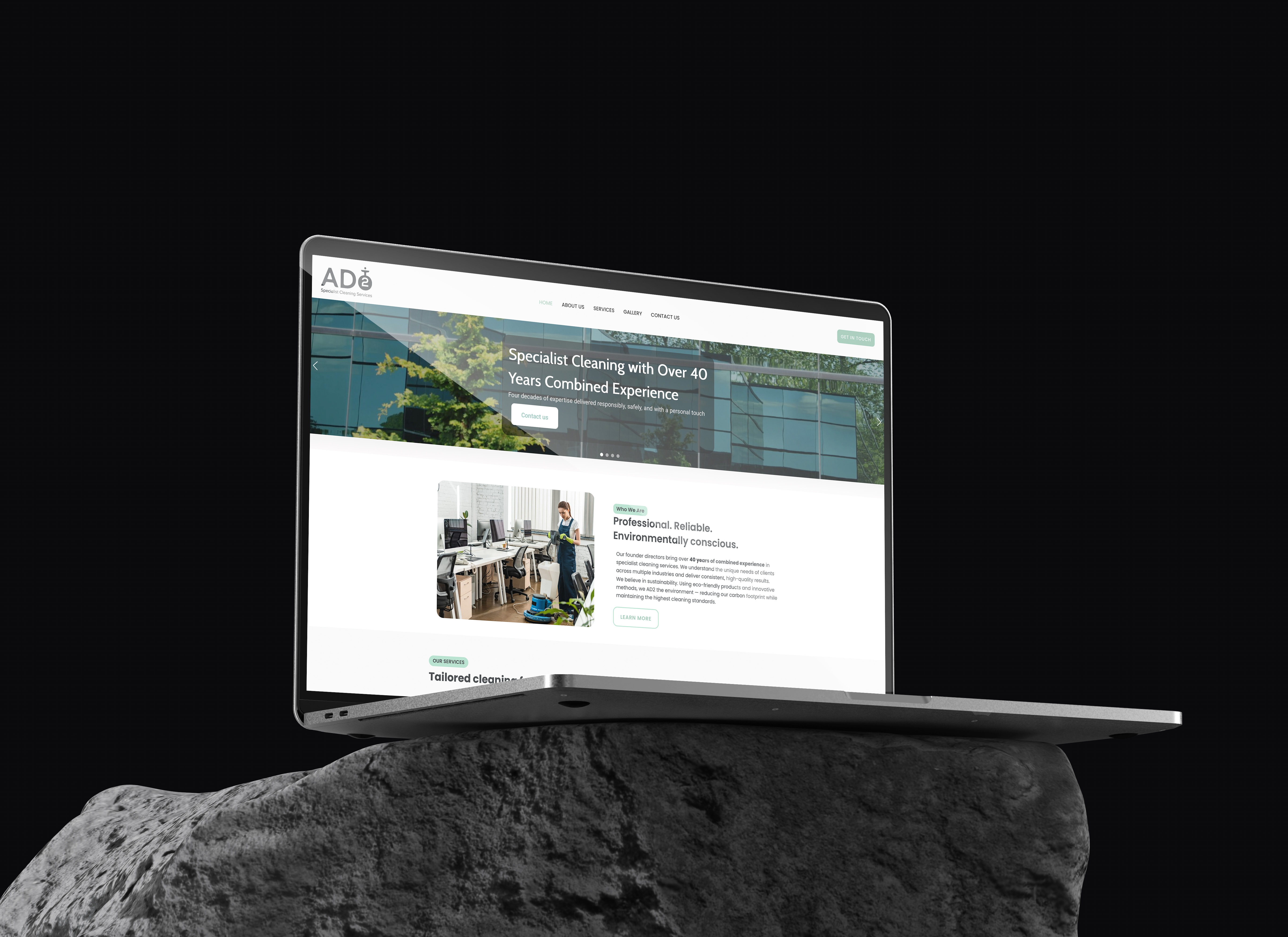
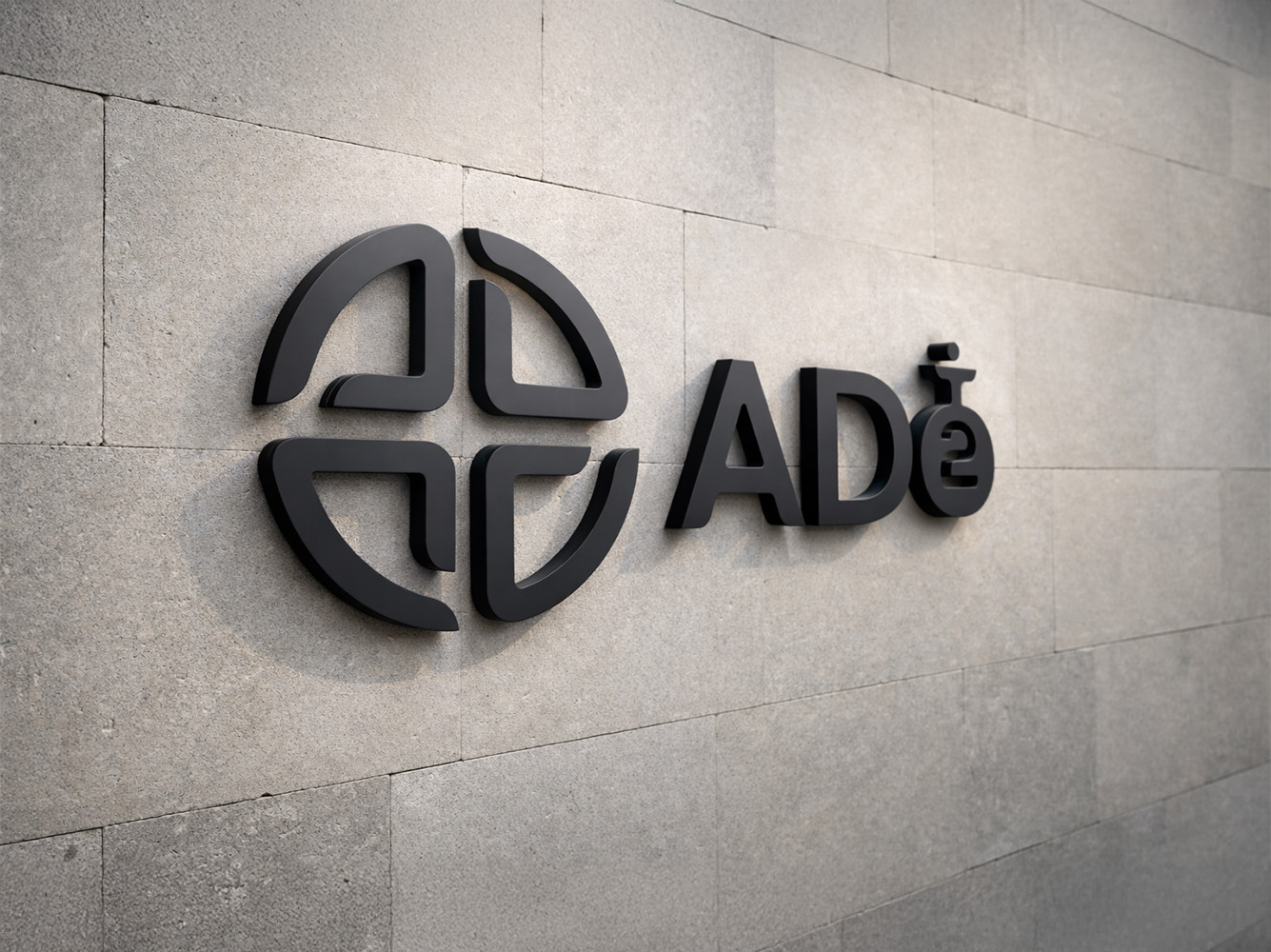
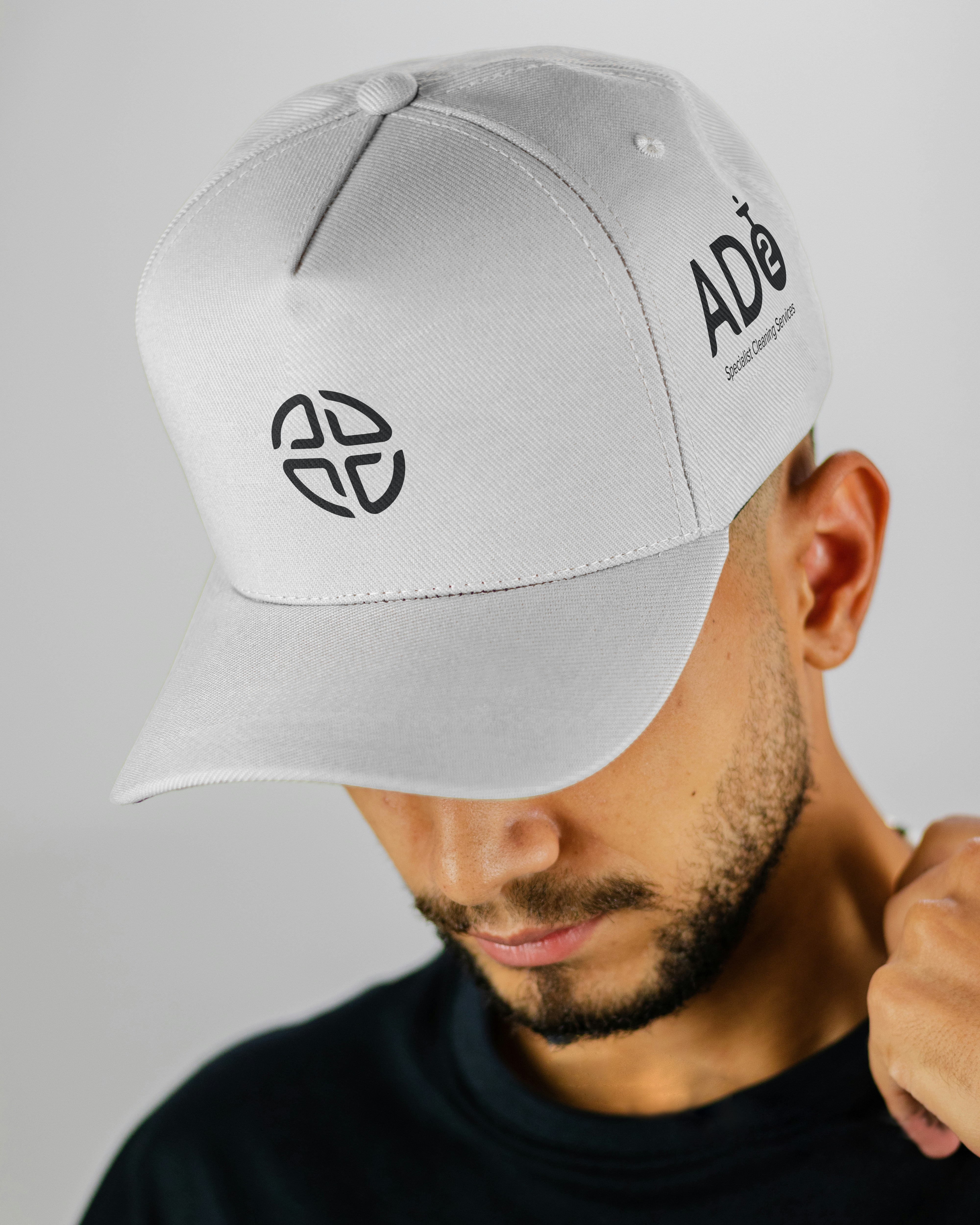
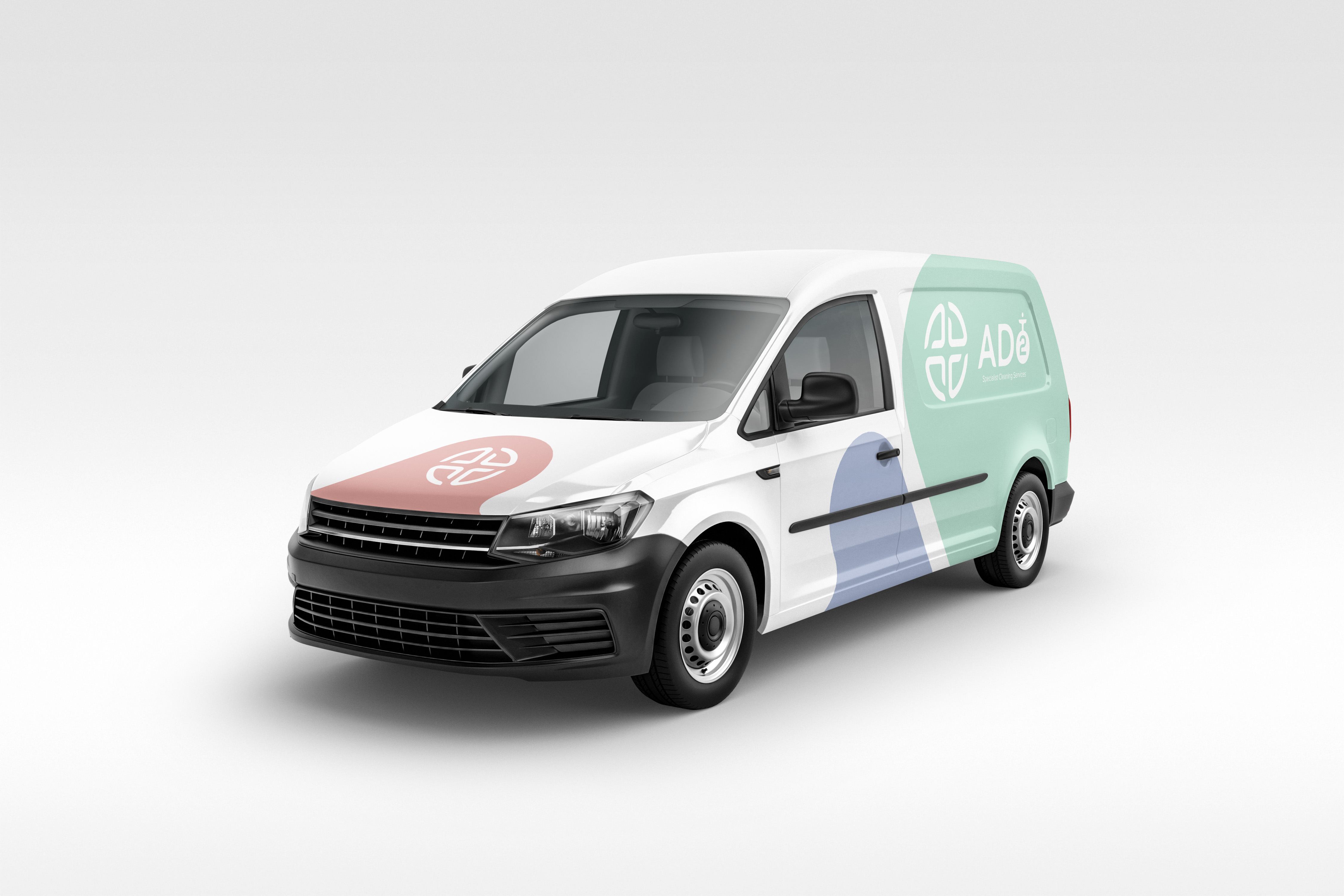
WZ Designs built the complete identity from scratch: wordmark, typeface, colour palette, brand guidelines, website, signage, vehicle livery, and uniform applications. Clean, precise, and professional. A brand that speaks directly to the corporate clients ATDO needed to win.